Unless Australian Sex Party does something interesting, new logos on ballot papers a wasted opportunity

Many moons ago, brands did not exist as they do today. There were no supermarket aisles. Packaging did not have logos, curly font, bright colours or intriguing shapes.
Instead, when we went to our local apothecary for ‘hair lotion’, we might be asked whether we wanted ‘Smith’ or ‘Brown’. We might respond, ‘Smith’. Confirming source, the bottle might be labeled, ‘Smith’s Hair Lotion’, and that would be enough for us.
In a nod to the dark ages, that is how political parties have been selling their wares to us in the ballot box since the beginning of time. No logos on the ballot papers. Just words.
Like the apothecary, this did not matter when there were only a few parties on the ballot paper. Although ‘Liberal’ and ‘Labor’ both start with an ‘L’. Just saying.
However, recent elections have seen columns of words from which we are meant to choose. Senate ballot papers are a standout example. And some of those words sound really similar. Take the Liberal Democrats (formerly called the Liberty and Democratic Party). Some say that in the last election, voters saw the word ‘Liberal’ and cast their vote accordingly, causing at least one Liberal Democrat to gain a Senate seat by mistake.
So, for the first time, 2016 election voters will be able to see logos next to words to help them choose. It’s like the birth of advertising all over again. Now we have more information to help us distinguish source.
Recent amendments to the Commonwealth Electoral Act 1918 (the Electoral Act) mean that new or existing political parties may lodge a logo for approval by the Electoral Commission. The approved logo can then appear next to candidate names on the House of Representatives ballot paper and above the line on the Senate ballot paper. The changes arose from a recommendation by the Joint Standing Committee on Electoral Matters after the confusion between similar named political parties at the 2013 election.
Early signs are hardly inspiring about what this new opportunity brings. Over the last couple of weeks, political parties have been required to advertise their proposed logo so that we have a chance to object.
Well, I object!
By and large, the logos seem to put last on their priority list the very thing they are meant to do: act as an appropriate ‘badge of origin’ distinguishing one Party from another, with the prospect of communicating more about the Party than just the name to discerning voters.
Senator Bob Day has launched a High Court case seeking to strike down recent amendments to the Act. The progress of the case can be seen here, the head note suggesting that one question for the Court will be whether the use of a party logo discriminates against independent candidates.
Mr Day’s court case will go its own way, but an advertising consultant might suggest the benefit of forming a micro-party to obtain the benefit of a logo in order to ‘tell your own story’. How have some of the micro-parties fared in their first logo attempts? Shortly, you can form your own view.
The ground rules
The logos are subject to some constraints, which makes sense given the potential printing cost to the Australian taxpayer.
The three most significant constraints are:
- the logo must be a vector graphic, essentially a digital image involving lines and shapes (c.f. a photograph or textural artwork)
- the logo has to be in black and white
- the logo must be contained within a frame of 10 mm by 10 mm (that’s 1 cm by 1 cm, people)
For more information, see the Commonwealth Electoral (Logo Requirements) Determination 2016.
Consideration of logo applications
Example 1: Let’s start with this one, which I put in the wasted opportunity basket.
The logo is closer to the much larger size on the AEC Notices page than its 1cm by 1cm appearance on the ballot paper.
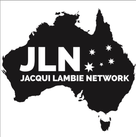
First, we see a map of Australia. Yawn. This must be the closest thing one can get to generic imagery for a political party. Imagine the discussion: “Let’s do a map of Australia. Great idea! People will know we really care about Australia. Because of the map.”
Secondly, there is an acronym that says, ‘JLN’. Does that mean ‘Jewish Life Network’ or ‘Junior League of Nashville’ (real organisations, by the way)? Barry Cassidy of ABC’s Insiders and five people in Canberra might call to mind ‘Jacqui Lambie Network’ when they see these initials.
For the rest of us, ‘JLN’ has little to no brand recognition with most Australians at all. We might know ‘Jacqui Lambie’, but Ms Lambie’s name is placed under the initials in micro font largely impossible to read.
Example 2: Let’s try another:
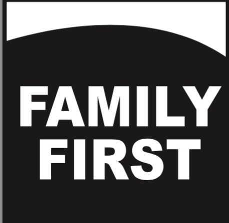
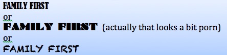
This is in the ‘why bother’ category. Surely ‘Family First’ could have at least gone for some interesting font, like this:
Example 3: Speaking of porn, Nick Xenophon might want to think twice about his own choice of logo, but that’s just my view.

Before logos are approved, they must be advertised and people have a chance to object. Grounds include if the logo is obscene, or if the logo is of any other person, or if the logo so nearly resembles the logo of any other person that it is likely to be confused with or mistaken for that logo, or if the logo is one that a reasonable person would think suggests a connection or relationship between the applicant and a registered political party if that connection or relationship does not in fact exist: s.129A Electoral Act. For more information about the approval process, see here.
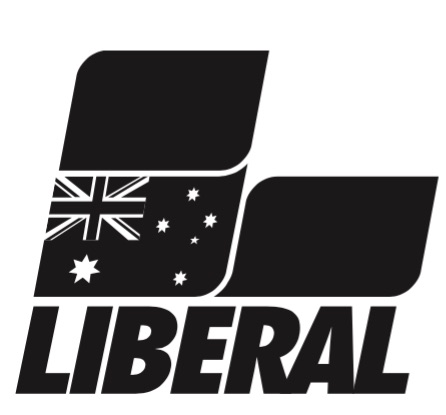
Example 4: Of course, words can sometimes be your friend, as the Liberal Democrats know. That the LibDem logo looks, well, wordy is hardly a surprise.
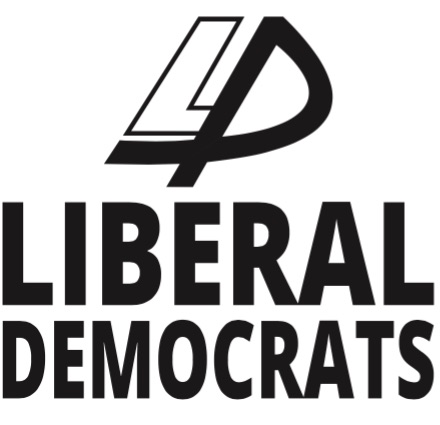
But the ‘real’ Liberals have their own secret weapon this election, namely, they can rely on their OWN logo to avoid confusion. Perhaps.
Example 5: Let’s try another:

In terms of generic iconography, we understand what the cross means. Whilst the prospect of a pair of boobs underneath a cross initially intrigues, I suspect it means something different, like ‘Australian Christians’ (because that’s what it is says on the application, not because the circles thing would trigger me to think that).
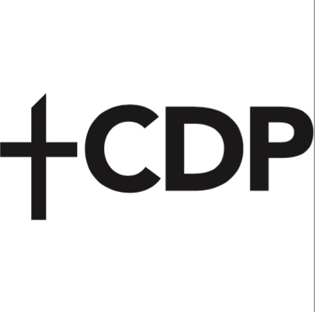
A problem with generic iconography is that someone else might use it too, like the Christian Democrat Party (Fred Nile Group). Query whether voters have sufficient visual information to distinguish one Christian party from the other.
Example 6: Let’s try another:
 Not to be confused with –

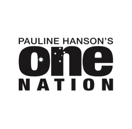
The One Nation logo may be vulnerable to legitimate objection by ONE Network Ten, on the basis that the One Nation logo so nearly resembles the logo of any other person that it is likely to be confused with or mistaken for that logo.
True it is, the word ONE appears similar, likely a product of the lower case presentation and similar font. Against this though, is that the launch of Pauline Hanson’s One Nation Party preceded the launch of ONE Network Ten by a couple of years. Accordingly, any objection might descend to a debate about which entity used the logo first. Further, there would likely be questions about whether the comparison would be between the most distinctive elements (‘One’) or a holistic interpretation (which would include the words ‘Pauline Hanson’ and ‘Nation’).
Interestingly, ONE Network Ten need only show confusion as to logo, not as to source. These are materially different concepts. For instance, I can look at the One Nation logo and wonder ‘Have they used the ONE Network Ten logo?’ (possible). This is quite different from speculating about whether the latter commercial television station is actually fielding a candidate in a Federal Election by reason of that logo (less likely).
Early winners
Whilst it’s slim pickings, a few logo entries deserve an award for effort.
In third place, we have the Glenn Lazarus Team. Yes – the NFL football shape is a little confusing, but it’s a logo, with a name underneath. There is even a slogan, ‘Doing the hard yards for Australia’! It’s a nice sporting analogy for people who like sport, and have to vote or they get fined. The ‘TM’ for ‘Trade Mark’ deserves special mention. These people care about their intellectual property, which is good.
 Because I like this logo, I haven’t scaled it to ballot paper size (1 cm by 1 cm). Keep an eye out for it, with your microscope.
In second place is the Science Party. The logo is devoid of words. It depicts some curious iconography, capable of causing the voter to pause and think. Is it part of a Rubik’s Cube? A bored voter tossing up an informal vote, intrigued by such a logo, might be tempted to do something unanticipated such as vote for a Party they had never heard of.

In first place is Ricky Muir. If you hate my choice, you’re not alone. I already have at least one side-bet going about this one. Craig (because that’s his name) thinks that, in the event of a double dissolution election, Ricky Muir is returning home and that I owe Craig a $100 Bunnings Voucher. I say, this logo means Ricky will keep his Senate seat in a DD election, and that with my voucher I’ll buy four Panther Vision 4 LED Power Caps (if they’re still in stock).

A logo is intended to create brand recognition in the eye of the consumer. This logo does just that. With this image, we know where to find Ricky Muir on the ballot form. Many of us wish him well after a stuttering start. That said, I’m a little curious about the flourishing beard when I thought a goatee was his preferred look…
As for the Australian Motoring Enthusiast Party (aka ‘AMEP’), in my view they have made the right call by using the image of a candidate personifying a political party which has not (yet) resonated in the Australian consciousness. Such an image might well represent their best chance of retaining a seat (in addition to some cozy preference deals, of course).
The Australian Sex Party logo
Those looking for the Australian Sex Party’s logo application must presently do so in vain. A vector image of two people engaging in horizontal folk dancing? Or two pairs of feet at the end of a bed? Now that would bring to life the ballot paper experience.
Indeed, the Sex Party’s existing image is distinctly un-tawdry.
Still, we can live in hope.

2 Responses to “Unless Australian Sex Party does something interesting, new logos on ballot papers a wasted opportunity”
Comment on Sustainable Australia’s?
I’m interested in your views!